02 / 06 Real Estate & Investment
R&B Investimentos
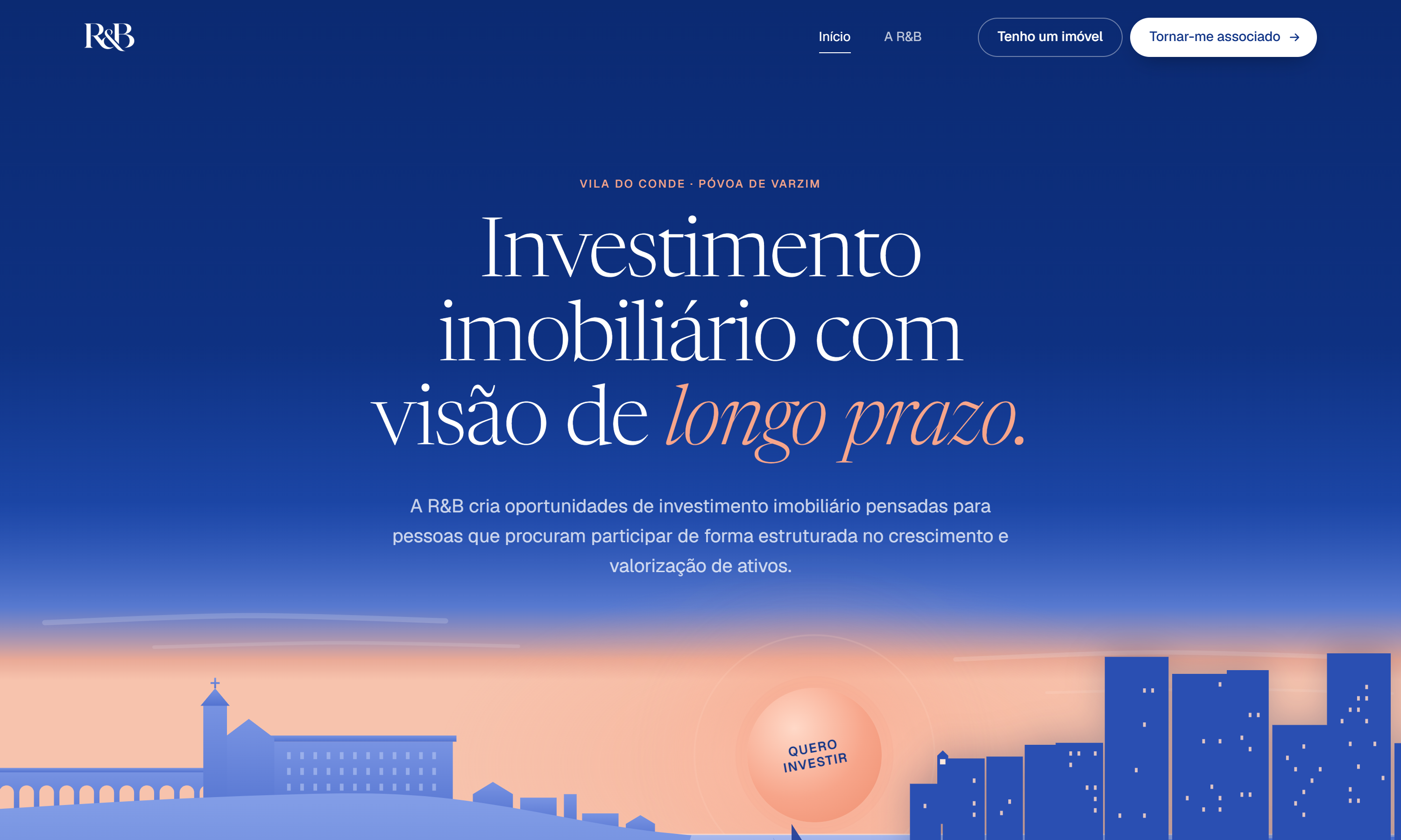
Real estate investment with a long-term view.A real estate investment company in Vila do Conde and Póvoa de Varzim, redesigned around two clear paths - investors who want to join operations and owners with a property to propose - under an illustrated dusk skyline of the two towns.
Overview
R&B identifies, analyses and develops real estate investment opportunities across every parish of Vila do Conde and Póvoa de Varzim. The site has two audiences with opposite needs - people looking to invest, and owners who might have the next opportunity - and it has to earn the trust of both without ever reading like a sales pitch or a listings portal.
Objectives
- Give investors and property owners each a clear, separate path from the very first screen
- Make the brand feel local and specific to the two towns, not like generic real estate stock imagery
- Turn joining as an associate and proposing a property into short, guided flows instead of open-ended contact forms
Process
- Drew the hero as a dusk illustration of the two towns' skylines in cobalt and peach, paired with a serif headline and a single 'Quero investir' call to action, so the first impression is the place itself.
- Structured the homepage around 'Dois caminhos. A mesma exigência.' - one path for investors, one for owners - followed by an illustrated map of where R&B operates and a plain list of what owners will be asked for.
- Built the investor onboarding as its own five-question page and the property proposal as an in-page dialog, then added the legal pages and an explicit risk disclaimer an investment site needs.
- Kept the stack deliberately small: semantic HTML, hand-written CSS and vanilla ES modules for the header, scroll motion, hero and dialogs, with no framework to ship or maintain.
Results
- A live site at rb-investimentos.vercel.app with the homepage, investor onboarding, property proposal flow and privacy, cookie and terms pages.
- A visual identity rooted in the two towns, carried from the hero illustration through to the map.
- Clear separation between the two audiences, each with its own guided next step.
Learnings
The redesign was mostly about subtraction. The earlier version walked visitors through services, process, projects and an FAQ; this one asks a single question - are you here to invest, or do you have a property? - and lets each answer lead somewhere specific. Deciding what not to build mattered more than any individual component.
Contact
The fastest way to reach me
rb6544758@gmail.com